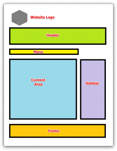
 If you are new to website building, it’s important to understand what is the anatomy of a website. Without this knowledge, you’ll be blasting your content all over the page which can be very confusing, thus leading to a bad user experience for the readers. In this article, let’s go behind the scene to check out the elements that make a good website structure.
A website has most of these features (if not all) and they serve a specific purpose to communicate with readers about your online presence.
#1 – Header
 The header is the top bar that sits above the content and it is essentially known for building online branding. In other words, it gives readers a general impression when they land on a website. Some use logos, header images or a combination of both.
Attractive images with captivating tagline are some of the factors that make readers come back to your site. Therefore, it’s worth spending some time to create a good quality header to reflect the brand of your website.
#2 – Menu
Beneath the header is a horizontal bar known as the primary menu. It contains the main topics or pages of a website and serves as a primary bearing for readers when they browse around.
Unless you have a huge website, keeping the menu in less than 8 topics or pages will make the menu bar looks less cluttered. If you want to accommodate more pages, check your WordPress theme to see if it allows you to extend a secondary or tertiary menu that usually sit under the primary bar.
#3 – Breadcrumbs
This feature basically tells the reader where they are on the website and how they can trace their navigation back to the main pages. For example, when you see Home/Website Building/Website Anatomy, it tells a reader that he or she is navigating from the ‘Homepage’, through ‘Website Building’ category before landing on the ‘Website Anatomy’ post.
Most WordPress themes come with breadcrumbs feature so do make sure you activate it within the settings.
#4 – Content
This area is where you display your web content. Creating a good quality content should always be the main focus when starting an online business and it should encompass some of these elements;
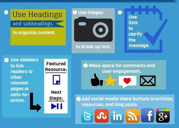
- A HI title, H2 or H3 subheadings followed by segments of short paragraphs.
- Informational content that derives from proper keyword research and analysis (AVOID keyword stuffing).
- Videos and images that are relevant to the topic of discussion (AVOID video or image stuffing).
- Internal and external links to give more information resources to the content (AVOID buying links).
- Call-to-action to lead readers to your website goals.
- Commenting area to allow reader engagement; the more people leave comments on your blog, the better quality your content becomes.
As for word counts, the general recommendation to engage comfortably with the readers is between 600 to 1000 words. Tips; the more you write, the better quality your content becomes. A content width of more than 30 words tends to make reading a bit difficult. Hence some themes offer sidebar columns to make the width smaller.

When reading from a mobile device, you’ll find that the main content occupies the entire width and whatever items that are placed on the sidebar will be pushed towards the end of the screen. However, this only applies if the theme is mobile responsive.
#5 – Sidebar
The sidebar feature is basically a column that resides on the left, right or below the content area. When the primary menu doesn’t have what the readers are looking for, chances are they might find it within the sidebar. Widgets (specific command boxes) are used to add functions into this column and they can display a variety of information such as;
- The biography and social profiles of the author.
- Newsletter signup.
- Testimonials from clients.
- Teaser to other popular articles.
- Resource pages.
- Recent comments on blog posts.
- Event updates on a calendar widget.
Having said that, you do not need to include all of the above. Remember, a cluttered sidebar especially one that is stuffed with advertisements will make your website look ‘sales-aggressive’ and that tends to drive people away from your site.
#6 – Footer

Footer, as the name denotes, resides at the base of the website. Also controlled by widgets, it contains the ‘less interesting’ yet important pages such as a company’s profile, privacy policy or sitemaps. For larger companies or organization websites, the footer can include FAQs, referral programs and also links to the media press.
Every Space on a Website Counts
So there you have it, the anatomical breakdowns of a website and the important roles of each element to make every space in the website counts with helpful information. Some of the orientation might differ according to theme selection, but they shouldn’t be too far off from what I have just described.
So, are you ready to put your anatomy knowledge into practice? The best platform to get started is to use a WordPress. If you haven’t got one yet, simply create a domain name using the SiteRubix platform to launch your website within minutes. Have fun!
If you need any help creating a blog or a business website with WordPress, just leave your questions in the comment area below and I’ll get back to you.

Hi Cathy, good pointers about websites here.
By content width, do you mean not having such chunky-sized paragraphs, or is it something different? If that’s it, then I’m with you. Anyway, I think that’s one of the most important things in a content-based website – makes the reading comfortable and not annoying.
Hi JP,
I know what you mean with comfortable reading. I personally won’t stay long on a webpage that confuses my reading pattern or don’t use images properly in the content.
I believe content width refers to the number of words in a single line of an article. 4-5 lines in a paragraph is recommended so that they would appear in smaller chunks. But then again, opinions could vary in terms of blogger’s preference.
Hi. I dropped by to learn how to make a reader friendly site and boy am I glad I did. I want to use the right widget bar to add affiliate info that will give my reader valuable information about some of the products that can be used. Is that difficult?
I love the way your site remains so clean and yet still offers loads of info.
Thank you for your kind comment, Linda.
Making use of the side bar for affiliate information isn’t a bad idea. But I would stay with minimal advertisement banners and put up relevant images (like what I have done on my side bar) to guide readers to my product review instead. I think that provides more valuable information rather placing affiliate links directly which will actually lead readers away from your site.
It’s not that difficult to do, Linda. If you need any help, just send me a PM at Wealthy Affiliate and I will be more than happy to help you out.
I can see from your post here that there is a lot that goes into making a website if it is to be done correctly.
This was very easy to follow and it all makes sense. I was under the impression that building it is quite straight forward if you have good guidance but getting high ranking on Google can be another task all together.
I’ll keep coming back here for information. Great site.
Hi there Chris,
Getting ranked in search engines is in every internet marketer’s wishlist. However, this post focuses more on the user experience side, although I believe that it somewhat helps on the SEO side too.
A reader who comes to your site will naturally want to know more about your brand and product. If you know how to take advantage of the website anatomy to help them navigate for the information that they are looking for, then you are this much closer to getting a conversion regardless of your page ranking.
Something as basic as this should not need explaining, but it does. Great article – It was very easy to read and your images complimented the content quite well. I also thought that you came across as an authority which gave me confidence that you know what you’re talking about.
Thank you for your kind comment Stu.
Most beginners started off without knowing how to structure their website – me included – and they could end up having a poor quality site despite their good web content. I have seen a few around and felt the need to research on this topic. Hope you have benefited from this as well.