 Great blogs, often times come with powerful images. However, using an irrelevant image could confuse your readers and make them leave your blog, sooner than you think. So are you wondering how to use images correctly in your web content? You could be doing some of these mistakes so let’s find out.
(1) Where to Get Them?
If you are new to blogging, you are likely to source for your images online. You could either use paid sites that offer high quality images or free sites, whereby the image quality are just as good, but you might have to do some digging to find the right one.
Unless you are striving for originality and tip-top professional look for your website, I personally find that the resources from free sites work just great. The only requirement for you to use them lawfully online is to include attribution to the image source on your site.
If you are looking for more originality without spending too much money, you can always take your own photos such as using Instagram (they take awesome pictures!!!) and upload them onto your blog post.
Whenever you do this, just make sure that you follow these safety internet tips to protect your privacy online.
(2) Are They Relevant?
It’s obvious that you should be using images that are relevant to your blog post. Objective oriented articles like products or service related usually have plenty of image resources, but subjective oriented articles such as tutorials or discussion based are a bit more challenging to find.
But there’s a way around it. Just the other day, I was reading an article about friendship building (discussion oriented) and the featured image was none other than a dog and his owner. Is that relevant at all? Absolutely! The dog is a symbol of a man’s best friend and the photo is a perfect representation of the topic.
So, think creatively and you’ll be surprised with various image choices out there.
(3) What Is the Format?
There are generally three types of image formats that you should know.
- GIF – For small-sized pictures with line art, simple designs or 2-3 colored logos.
- PNG – For nice looking images in small files (not ideal for professional printing).
- JPG – For colorful and complex images (just like photographs). This is the format that most of us are familiar with.
All of these are good for a blog post and the choice largely depends on the relevancy of the image to your web content.
(4) How Do You Check for Quality?
One of the tenets of image quality is understanding the concept of pixels, which are basically tiny little boxes on the PC screen. Generally, the more the pixels, the better quality you’ll be getting out of a photo because it shows more details.
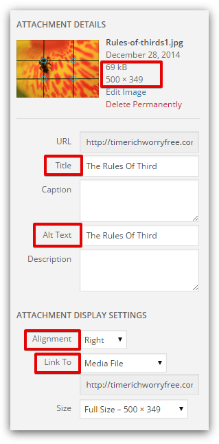
![]() It is usually quoted as ‘width x height’ in a picture description file (see image on the right). For general blogging, small to medium pixels images blend very well with articles.
It is usually quoted as ‘width x height’ in a picture description file (see image on the right). For general blogging, small to medium pixels images blend very well with articles.
When it comes to editing, higher pixels can be shrunk to maintain the quality of the images, but when enlarging smaller pixels, the image can turn out to be of very poor quality and look distorted.
As the pixels increase, so does the file size. Too big a file can cause the page to load slower and this is not good for the user experience. So it would be wise to keep the size range between 300-400kB or less.
A great site that can do all these image editing for free is PicMonkey and it is user friendly too.
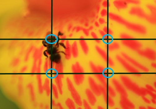
Another attribute that defines an image quality actually derives from the guidelines of photography and it is called ‘The Rules of Third’. For example, an image can be divided into 3 horizontal and 3 vertical imaginary lines (see image below).

According to the guideline, any subject that falls along or at the intersection of these lines, will give the image more tension, energy and make it looks more natural to the human eyes.
So if you have the choice, find or take an image that favor this guideline to give your blog a more professional look.
(5) What about Adding Text?
For images that you want to provide a side-by-side description, you could add text to the images by using an online program called Monosnap. I often use this free software to add relevant text or edit screenshots to the pictures that I took (just like what I did with the two images above).
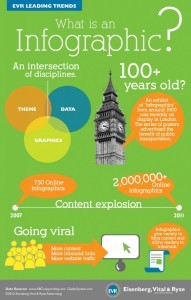
 Another form of image with text that you are probably familiar with by now is called an infographic. Most infographics are pretty long images that can really take up a lot of space in a blog and hamper the page loading speed.
So what I would often do is to crop a small portion of the infographic that’s relevant to my content and use the Responsive Lightbox plugin to pop up the image for better readability. Click the infographic on your right to see what I mean.
Alternatively, you can also create your own infographic using Piktochart and embed it on your website.
(6) Important Tips for Attachment
These tips would apply if you are using WordPress to create your website. When adding an image (also known as the media), you would see a column on your right that says attachment details.
 In that column, you’ll find the size and pixel quality of the image that you have selected. Here are some tips on how to fill out the other columns to improve on your website SEO.
- Fill out an appropriate TITLE for the image instead of using the default name such as IMG1234, which doesn’t make any sense.
- Use your targeted long tail keywords in the ALT TEXT as this provides additional information for search engines to crawl your site.
In attachment settings, do consider aligning the image to the right side of the text (instead of the left). There are actually a few theories for this.
- The general reading pattern is normally from left to right, so naturally, important text content should come before an image.
- 90% of the world’s population are right handed people so they generally ‘trust’ a site better when images are placed on the right.
- Google spiders also ‘read’ from left to right when they crawl your web page, hence the importance of adding Title Tags and Alt Text as mentioned previously.
Next, link the image to your WordPress media if you want it to show up in the light box feature, or to a custom URL if you want to point it to a certain webpage, which can either be internal or external. Choosing ‘none’ will render the image non-clickable.
Lastly, Share It Socially
I couldn’t think of one social network that doesn’t like fancy images. Pinterest is a good example that people use to share about their business blogs these days. So once you have completed a fantastic article, remember to always share the content and images with your readers.
I hope you have found some values from this article. If you like to learn more, check out this video training by Jay from Wealthy Affiliate as he walks you through how to use images effectively on your web content.
Do you have any thoughts or questions about using images on your content? Please leave them below and I’ll get back to you.


Some great tips here! 🙂 I for one have never thought of the reasoning of using your image to the right rather than left side. I always just seem to alternate (might have to go and edit a few posts on my site).
Hi Karina,
The alternate pattern is alright. Just start with your first image on the right and let the others flow naturally to your eyes. If you wish to learn more about image SEO, Jay from Wealthy Affiliate has got a great webinar covering this topic. You should check it out.
Hi Cathy,
Thanks for another great post. I learnt a couple of things here. The rule of thirds, I had never heard of this, but will certainly be looking out for this in the future. I suppose it’s the same idea as positioning the horizon at about a third of the way down in a landscape photo.
The other was the Monosnap software. I’ve just downloaded it and played around with it for a few minutes. Really useful!
Hi Peter,
Monosnap is really a handy tool. I have been using it on most of my blog post ever since I started blogging. It compliments my written content very nicely. Glad you benefited from this article.
Great info about using photo’s in your blog. I am using WordPress and had trouble with the pictures quite a bit, but this article helps. I was having a huge issue resizing and fitting them into my blogs. Thanks for the tips on image quality too. Just something I have not thought of.
Hi Ship,
If you are using WordPress, there’s a feature in the media for editing the images – although the choices are quite limited. However, if I remember correctly, I used to deal with ‘stubborn’ images that just won’t fit into some of my text, no matter how many times I tried to customize the height and width. I found out later that it has got to do with my WordPress theme (I was using a free theme then and there were some technical bugs in it).
When I switched to using Genesis, the realignment issue resolved. In fact, my current theme ‘seems to know’ which is the best image size to go along with my paragraphs. So, if you are still struggling with the issue, I suggest you take a look at your theme.
Hope this helps.
Hi Cathy,
Another first class post on an important subject. I love the way you have even got into the mind of the photographer with your ‘rule of thirds’. Actually, it’s now really a basic design rule, photographer or not, well worth knowing about.
Hi Rob,
Thanks for your feedback. The ‘rule of thirds’ is an interesting one because it really gives an image more perspective and sometimes, allow the image to ‘speak’ for itself. Besides, it’s not a difficult concept to grasp and I think anyone can easily implement this technique on their blogs.
Great insight there about use of images. I have just created a WordPress blog and is struggling a bit with this whole thing about images. Now I know and shall use your valuable content here to improve my site graphically. Thanks Cathy
Hi Josphat,
It’s understandable if you are using WordPress for the first time. Give it a try and error and you’ll find what fits and what doesn’t. If you need any help, just PM me at WA.
This is a great article! I have recently created my first website and have some trouble trying to figure out the aspects of adding pictures to my site and just finding them without effecting any policies. I will bookmark this site and check back to keep learning.
Hi Anthony,
It can be very confusing to decide what kind of images that you can use for your websites. Most beginners start with free images, but even that, the word ‘free’ can be quite ambiguous. Here’s a quick tutorial on how you can use free images on your website – without getting into trouble.
Hope this helps.