 One of the most common mistakes I see with new online business is this – great topic idea, but severely lacking the nuts and bolts that make a page more search engine and reader friendly. So I thought it would be a good idea to show you how to improve the user experience on a website using these simple tips, if you haven’t already done so.
Tips to Improve User Experience on Your Website
1) Use a Mobile Responsive Theme
With the popularity of smartphone and tablets, web search from mobile devices have increased tremendously. This means more opportunity for online businesses to reach out to new users; that is if the websites are mobile responsive.
The lack of this feature will not only make your site look disproportionate, it would be difficult to read and extremely hard to navigate. Consequently, visitors will abandon the website and THAT would result in a great loss of traffic for online businesses.
If you have a website and would like to know if it’s responsive or not, simply type in your domain name with this tool from Studiopress. It will show your current web appearance across different mobile sizes.
If you are using WordPress, most of the themes (even the free ones) are mobile responsive out of the box. So that’s one good advantage of using this publishing platform.
2) Change the Default Permalink Structure
The permalink, also known as permanent URL, is the web address of a published content. It is made up of two segments, your domain name and a tag. If you are new to WordPress, you might find your current permalink structure looking something like this;
 This is a default setting which merely tells WordPress where the content can be found in the database. It doesn’t make sense to the search engine crawlers and, especially to the readers. So, to optimize the tag, you need to go to Settings > Permalink and check on Post Name that includes this tag – /sample-post/ – which is the slug of the post.

After saving, refresh the link and it should display the full title of your post in the slug area. Now, you have got yourself an optimized and user-friendly permalink.
3) Create a Personal Identity
They say, behind every website is a person and an ‘About Me’ page is a great place to start. It’s not about showing off though; it’s more of an introduction to who you really are so that people feel more comfortable connecting with you online. What would be more convincing is to include a picture of yourself.
However, a lot of new webmasters seem to ignore the importance of this page with the common response – “I don’t think I look good enough”. Well, here are a few tips to help you ‘look better’;
- Get a friend who’s good at photography to take a professional picture of you.
- If your friend doesn’t want to help, go to WalMart.
- Write about what inspires you and what you wish to achieve in life (people relate to personal stories better).
- And welcome readers to your blog without pretense (people can read in between the lines, you know).
Don’t rush through this page. Think about what you really want to say and write it with your heart.
4) Create a Sense of Space
Most of us started without any web design knowledge, so our initial content pretty much look like an essay assignment; we jam packed information in one long piece of content. The problem is, people can’t focus when they read things like that on the screen.
Take a look at this example;
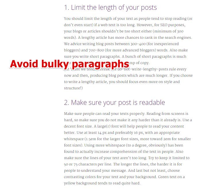
When you have one big chunk of paragraph, you lose your reader’s attention within seconds. Too much white space highlights the lack of content and user guidance. In both situations, you are again, likely to send your traffic away because people no longer have any interest to read.
Therefore, consider breaking the content into smaller paragraph, but maintain a good white space balance that will allow your readers to breath while they digest the information on your site.
Bonus Tips;
Reading space is important too. Make sure the font of your text doesn’t strain the reader’s eyes. If you are not sure about this, right click on the text and a menu will pop up. Click on ‘Inspect’ (Chrome browser) and search for the code under styling that says media=”all”body followed by ‘font size’.
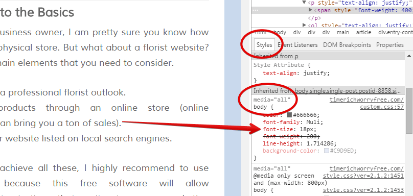
In the image above, my font size is 18px. All you need to do now is to change this number, watch the preview of the original text until you find one that’s comfortable to the eyes.
5) Write Good Quality Content
A good quality content here doesn’t necessarily mean perfect English. What’s more important is relevance; the blog title and the blog content must complement one another. If your title is about Product Review A, but you wrote about Product Review B, then there is no relevance at all. Readers who click on the title, expecting to know more about Product A would be confused with what they actually read.
So always adhere to the message of the title; elaborate instead of deviating from it.
6) Activate The Commenting System
I know this might sound surprising, but there are blogs that don’t have a commenting system. While some website owners choose not to due to excessive spamming, as a new blogger, you should allow people to leave comments, because;
- It’s a good avenue for readers to acknowledge your article.
- It helps to track article performances.
- It adds more information to preexisting content, thus improving the SEO of your blog.
- It shows people that you are interested in reader’s engagement.
If you are already using WordPress, all you need is to go to Setting > Discussion and activate the commenting system. Within the setting, make sure you check these 3 areas.
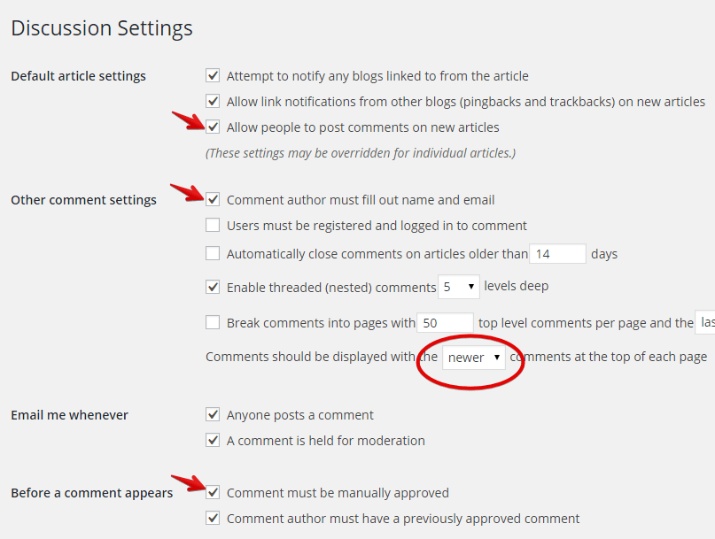
This would prevent the invasion of spam comments and keep your blog looking fresh and legit at all times. While you are at it, do make sure that you also take the time to create a Gravatar and respond to the readers comment in a timely manner.
7) Optimize Social Sharing
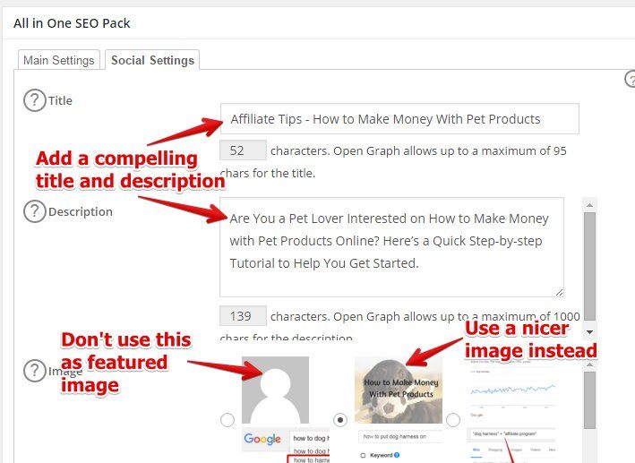
I can’t tell you how many times I have wanted to share an interesting post, but couldn’t find the social button anywhere on the blog. And when I did, it pulls out the ‘mystery man’ as the featured image which is totally irrelevant to the content of the post.
Social signal is an off-page SEO factor used for site ranking and it’s crucial to implement this feature from the very start of your website creation. Just install and setup All in One SEO and optimize the social setting that can be found right at the bottom of the post editing dashboard.
Improvement Right at Your Fingertips
As you can see, you don’t need any special software or professional services to learn how to improve the user experience on a website. Everything is right within WordPress which you can implement in minutes. So learn how to do it right by following the techniques that I’ve just shared with you and hopefully, that will improve your overall online traffic as well.
Do you have any thoughts or questions about this topic? Just leave them in the comment area below and I’ll get back to you.

Being a website owner, I think that a user friendly experience goes a long way in increasing the traffic and elevating the website’s popularity. All these tips are very helpful and go a long way in making the website user friendly. I have been employing many of these tactics and they have done wonders for me. Thank you!
Thanks for these great tips!
It seems that I have checked off everything on this list. One thing I would like to add if the color of the font and background. For most websites, it’s best to go with black text on a white background. Any other color can end up straining the eyes.
Yup, that’s certainly one of the tips to improve the user experience. Thanks for pointing it out!
Hi Cathy,
I’ve been looking into ways I can make my site more compatible for mobiles as this does seem to be the way that the market is moving forward.
There is some really interesting research on how mobile browsing will very soon take over from regular browsing. I’ll check out those themes – they sound like a really good idea.
Hi Nate,
WordPress offers a lot of mobile responsive theme and you can use the free SiteRubix to check them out before building your website. I usually create a few main pages to put into the menu navigation and some blog posts using the Lorem Ipsum text generator just to see how things would look like on my desktop and my mobile.
Hope this helps.
Great site. I don’t know a lot about this topic. I like that you break it down into steps so its not so overwhelming. Reading your site, I am thinking of ways to make my own site user friendly. I have never really built a website until now, it’s rather intimidating, however, having help navigating through has been a God send.
Hi there Maria,
I am glad that you are taking the first step towards learning something that you know nothing about. Building a WordPress website is actually quite easy, especially with the help of the SiteRubix hosting platform. I would suggest that you check out other blogs in your niche, see what they do and what you can do better on your site. Don’t worry about making mistakes – there’s always a solution to that.
If you need any help, just let me know ok.
Hi Cathy – this is a really awesome post about building a successful website and gaining more traffic. I agree with everything you said, especially about the “About Me” section. I’ve found that a lot of people don’t do this anymore. Can you recommend any educational program that can teach me more about internet traffic and keywords & such?
Sure Matt,
You can check out the training at Wealthy Affiliate for free. In the first level, they will walk you through all the basic steps you need to know about building a structural website. Subsequently, you’ll learn about researching long tail keywords and using them to target search and paid traffic. Their techniques have proven to work for many years and a lot of members were able to create successful businesses from it. I highly recommend that you check it out!