 After blogging for some time, you’ll find that getting readers to do exactly what you want them to do can be a very challenging task. Most often than not, the path that you laid out on your website isn’t clear enough so you are not really getting their attention.
Well, one of the ways to fix this problem is to make a special page and in this article, I’ll show you how to design a good landing page to get readers to focus on what you have to offer.
What Is a Landing Page?
A landing page is basically a standalone web page that’s created with a sole purpose in mind – to convert readers into customers. It is usually displayed with minimal navigation so that the content can lead readers straight to the conversion goal.
A goal can be a product or services offered in exchange for a reader’s information which will later be used for future promotion purposes. Hence, a landing page is actually a great marketing tool for a business website to generate more leads and build customers’ trust.
What Landing Pages Used to Look Like?
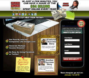
Do you remember seeing any of these web pages on the internet before?
Yup, these are also called ‘squeeze pages’ and they were very popular once a upon a time in promoting a certain product. However, this form of landing page inherited a bad reputation because online scam sites used them so aggressively to con readers with hyped information. Plus, they are so cluttered and confusing to look at.
As you can see with the examples above, the content is filled with persuasive words and images so tempting that you might want to give your contact information voluntarily in order to know more. Many people have been scammed this way and therefore, creating a web page like this can actually make readers think negatively about your product instead of the other way round.
What Proper Landing Pages Should Look Like?
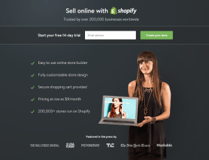
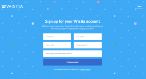
Online businesses are now using landing pages to create a good first impression by focusing on two things; simplicity and trustworthy information. Take a look at these two examples.
They are not cluttered with pretentious content and they clearly tell you what to expect so that you can make an educated decision whether to take up the offer or not. This is the kind of landing pages that will gain trust and get people to actually read the message, especially if you are running ads.
How to Design a Good Landing Page – The Basic Anatomy
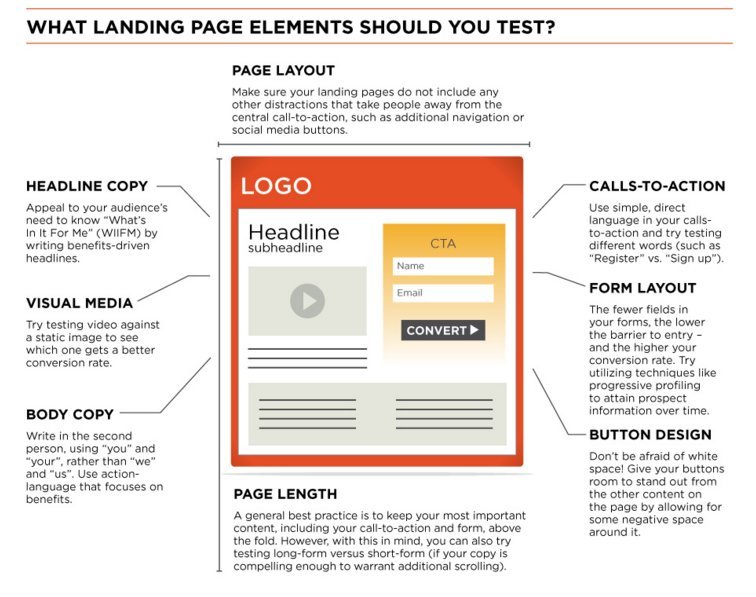
Like most things on the web, a good looking page has a recommended structure. Each element plays an important role in conversion, so let’s see what they are.
(1) Page Title
Generally, readers ‘land’ onto a landing page through keywords which they either read on another webpage or click directly on an ad. They click on the keywords because it resembles their search intention. As the title is the first thing that people would read, it’s important to make sure that the keywords that lead them to the page is relevant to the meaning of the title.
For example, if they clicked on “Learn Affiliate Marketing” and landed on a page title that talks about “Setting Up an Online Store”, readers are likely to exit the page because it’s irrelevant to what they have in mind in the first place.
Tips;
- Use bold and title case to make the page title stand out.
- Sprinkle SEO keywords in the title to improve search engine visibility.
- Keep the title concise. Don’t confuse or worse, scare the readers on the first impression.
(2) Content Summary
This is the meat of your landing page. If you are able to get readers’ attention through a relevant title, then you also want to make sure that they stick with you until the very end. In this segment, it’s important to highlight the key benefits of the products and you want to do this by offering a good information instead of trying to push a sale.
Tips;
- Be straightforward. Don’t make the readers guess what you are trying to offer.
- Let them know what they can get so that it meets their expectations.
- Lengthy text bores readers. So always break the content with images/media, subheadings or bullet points to get your message across.
(3) Social Proof
Whether you are selling smartphone covers or an online book, users are going to give positive reviews if they are good products. In that case, you should leverage these comments as proof that your product really works. This is extremely important to build confidence and trust as you lead readers to the purchasing lane.
Tips:
- Use Monosnap to take snapshots of customers’ comments. It’s a free and easy to use tool.
- Display positive reviews from new, long term customers and yourself too.
- Take advantage of social media comments to show readers that you are really serious about your online business.
(4) Call-to-action (CTA)
The CTA is the most crucial part of a landing page because that is where your business goal resides with merchant links or affiliate links. The context and design should be in line with the page title and body content, but there’s one challenge; you can only convey your message in a few words.
Hence, learn to select words that people generally trust and most importantly, guide them to take the action that is desired by your business.
Tips:
- CTA isn’t just limited to selling. You can also use it for product trials, subscription, downloading information or event registration.
- Make the CTA bold, beautiful and brief to attract attention.
- But keep it to your business values and maintain the reader’s trust on your site.
Test Your Landing Page
Now that you know the key elements on how to design a good landing page, the next step is to publish a few copies and find out which one converts better. This step is also known as A/B testing, where you take two versions of the same page, test them out at the same time to see which one gets more response from the readers.

However, keep in mind that there’s no right formula for a perfect landing page. The success of your goal conversions very much depends on the behavior of the targeted audience, your choices of ‘sales’ words and most importantly, the amount of time and money you spend in testing out different landing pages.
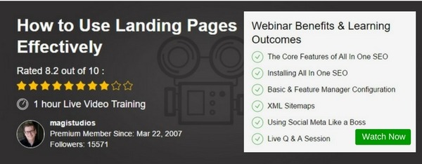
For more information, watch this webinar (for free) by Wealthy Affiliate to learn how to use them effectively for your online business.
Do you have any thoughts or questions about designing landing pages? Please leave them in the comment area below and I’ll get back to you. Also, if you find this article helpful, please share it with your friends. Thanks!


Hi Cathy,
I think your posts on landing pages is spot on. I was looking into creating one but I was a bit lost on how to do it. Your advice is really clear and I really like the checklist and diagrams of the key points a landing page should have. I guess I will try your method out and let you know.
Hi there Andrea, glad to know you benefited from this article. Let me know if you need any other help.
Hi Cathy,
I like your post about landing pages, it is an interesting marketing idea, I never tried before, but after reading your post, I am going to consider making one. I also like very much the idea of testing some different landing pages before choosing the most suitable one.
Thanks for sharing such informative and useful post.
Hi Cathy. You have a nice post here about how to set up a landing page. It’s thorough and straight to the point. I would also like to mention that I didn’t know that landing pages from back in the day were pretty much full of fluff that didn’t “hold water.” Also, it was you say that scammy websites used these which, in my mind, was so true. This was probably the main reason why so many people were scared off and just clicked the top right corner [X] to get off that website (me included).
Hi there Armand,
We have all seen the fluffy squeeze pages and to make it more intrusive, some don’t even come with the [X] option. Sometimes, you are forced to close the entire browser just to get out of the site. That’s how desperate these marketers are.
Hopefully this article has shed some light for you to come up with better landing pages.
Hey just wanted to say great information on how to make a great landing page found it very useful information . I do agree with those landing pages most folks these day when they see them stay away because they have been scammed before. IS there any kind d of program you use for landing page?
Welcome to my blog Inzhirov,
I have actually been messing around with a program called WishPond. You can design your own landing page using their templates OR create your own. There’s a bit of learning curve in using their drag-and-drop feature, but there is also plenty of room for creativity.
I’ll be publishing a post about it soon, so stay tuned.
Hi Cathy, I remember those sleezy looking landing pages from when I just started out online. Unfortunately, many of them are still around especially on offers from ClickBank. It’s great you pointed out what a great landing page looks like vs the sleeze ball ones. Keep up the good work. I learned a lot of things that I can also use when I decide to create landing pages.
Yup, a lot of ClickBank merchants still use them and I wonder if that actually helps in getting more sales or the other way round. The sleezy ones don’t really give people a lot of confidence on what they are buying, do they. There are some good examples at WishPond if you wish to have a look.
Thank you so much for sharing this! I have been searching and searching for easy to understand answers on the differences between squeeze pages, landing pages, sales pages, etc. and what to include in each. You have made this so easy to follow and with such great info! Thanks for the visual too on what a good landing page should look like. I am not very familiar with A/B testing. Do you have another article specifically about this? I would love to learn more =)
Jess
Hi there Jess,
I am glad you gained something beneficial from this article. I don’t have an article in mind about A/B testing but I would recommend that you watch this webinar by Jay from Wealthy Affiliate as he discussed about the subject matter in depth. The video training is very easy to follow so do check it out.
Hi Cathy, great post. I was looking to put a landing page together for my business and at a loss for what to do but you have made this very simplistic in your staged approach. I was going to jump straight in but after reading this article I guess I should now add AB testing to my list. Keep up the good work, I’ll be back!
Hey there,
Designing a landing page is very different from writing a blog post/page. I remember it took me almost half a day to figure out my first template, only to delete and to start all over again when I found out I was doing it wrongly. But the more you work on it, the better you’ll become at creating different version (hence AB testing) for your campaign.
Wishpond offers some free templates, so do check them out if you are interested.
HI Cathy,
Thanks again for a very thorough and thoughtful post most of us ignore. We focus mostly in content because ‘content is king’. Nevertheless, we forget about specific and most important details like landing pages, forgetting that landing pages have content as well and it is crucial to put the best and actionable ideas in it – to grab and keep visitor’s attention, then to lead them to do what we want them to do -call to action as you said-.
I am always busy trying to work on the best marketing strategies to focus on, but because of that matter, perhaps I have neglected my homepage in that way. So I am very glad I read your great article, and now I am excited about my upcoming plans on using your tips and advice on how to design a good landing page.
Now, I just have one question – Is Monosnap free OR about how much it costs? I have never used it before, however, I have heard nothing but good things about the product.
Thank you again and, I will be bookmarking your site to keep coming back for more good stuff.
Welcome to my blog, Olivia.
I am glad to know that you learned something from this article. Landing pages are part of the online marketing strategy and learning how to create a good one will help lead more customers to your conversion goals.
To answer your question, Monosnap is a free tool. It’s very basic and nothing too difficult. I have been using the tool from the very beginning of my website development and totally loving it!